Past Forward Collection
Interface's 50th Anniversary global product launch — a campaign built around one provocation: what if good design didn't need to be replaced?
The Past Forward Collection pushes back against trend-chasing, advocating instead for design that earns longevity. The strategic premise: thoughtful, durable design reduces unnecessary consumption while competing more effectively in the market over time.
DETAILS:
Past Forward Global Product Launch
Interface's 50th Anniversary Collection
Role:
Art Director
Creative Direction & Campaign
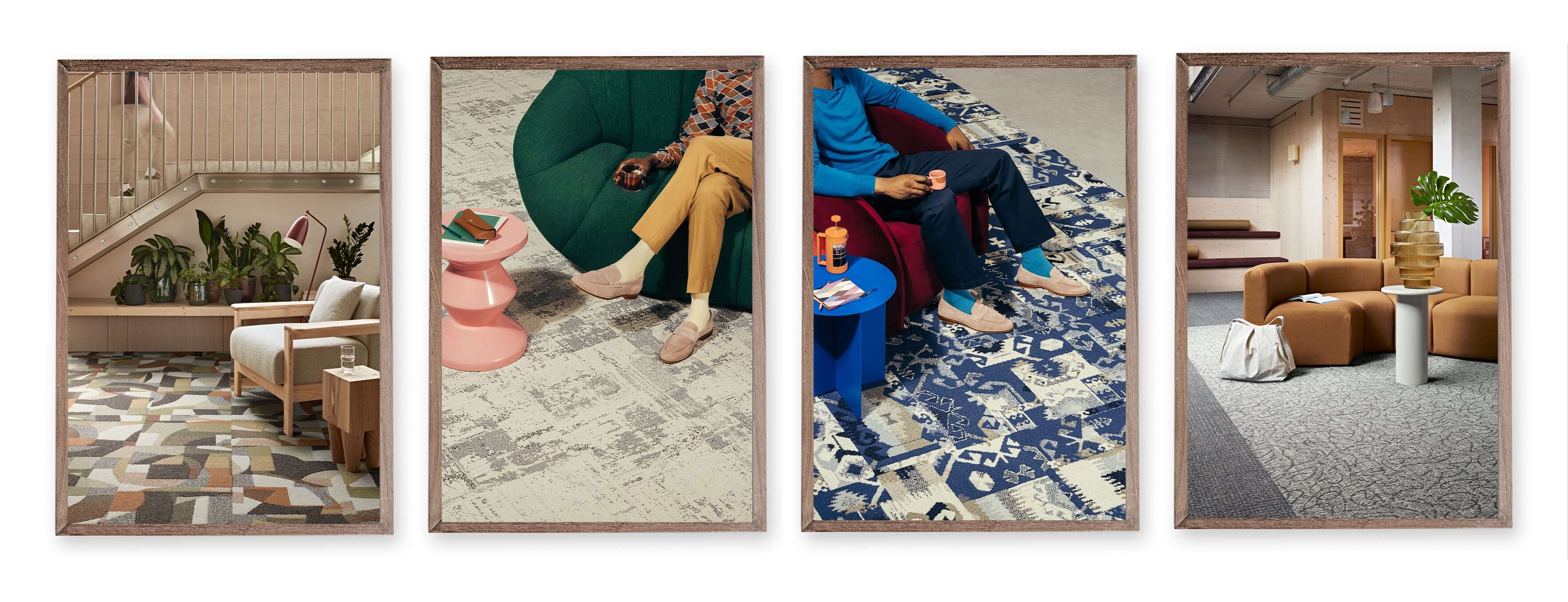
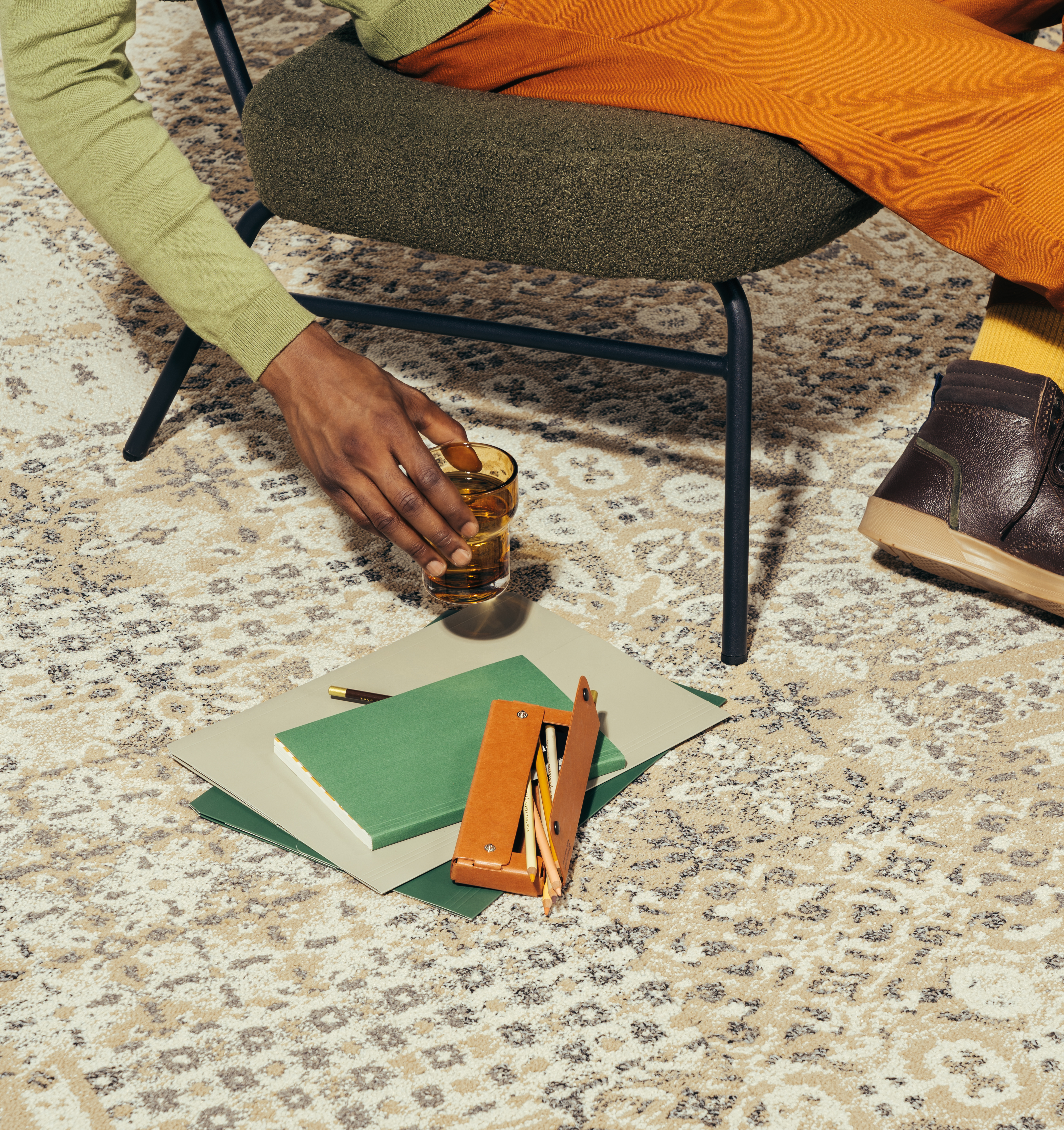
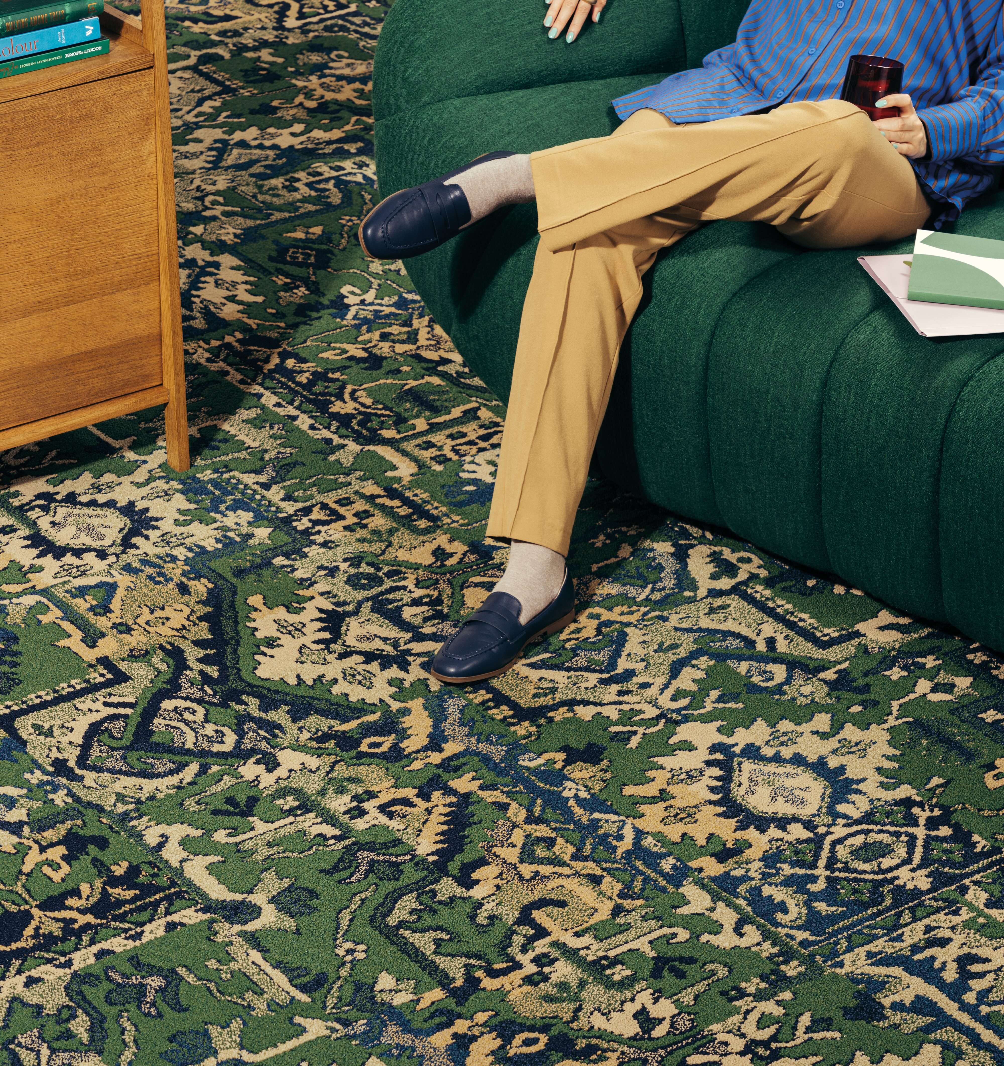
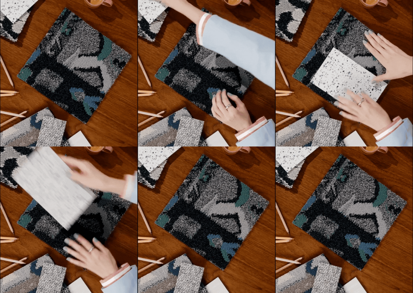
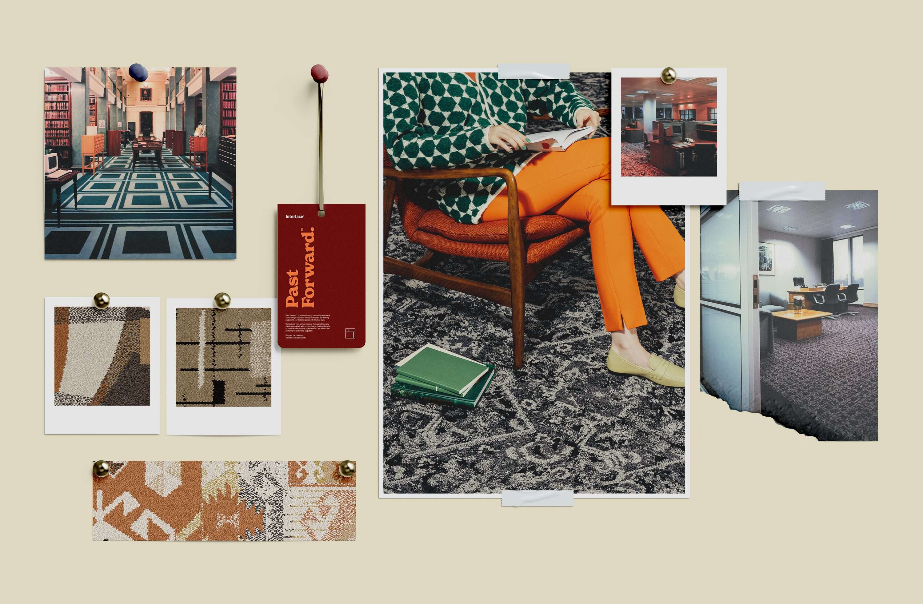
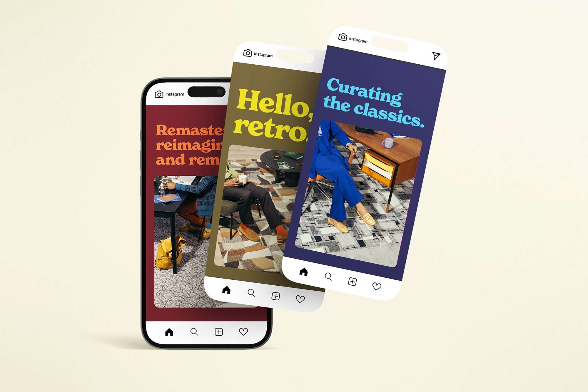
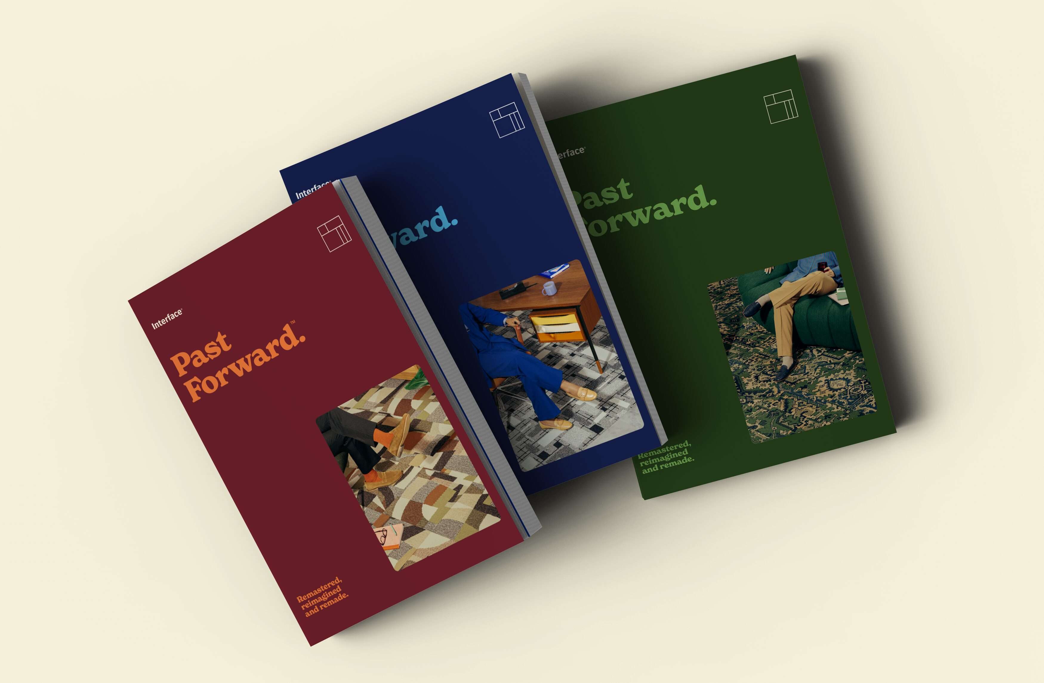
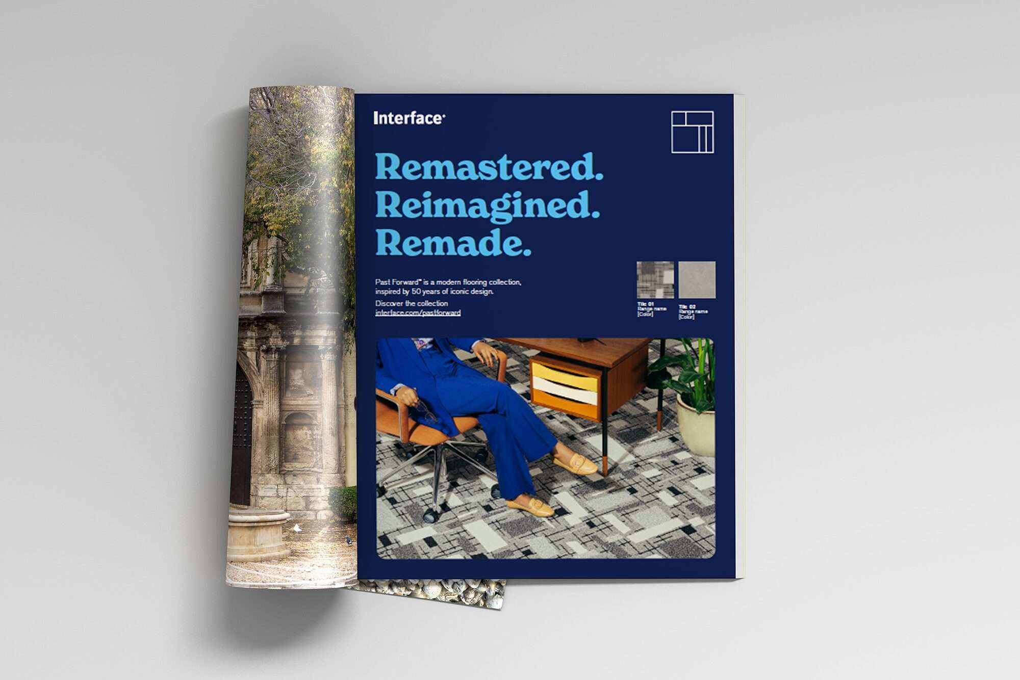
Every decision reinforced the core tension of past/forward. A campaign-specific font paired with the master brand font visually bridged heritage and innovation, history and forward motion in one system. The visual language extended that idea through contemporary styling layered with nostalgic undertones: a retro palette of rusts, ochres, blues, and greens that let the product patterns carry the energy. The result positions Past Forward not just as a collection but as a point of view — that honoring design history and building toward sustainability aren't in conflict. They're the same move.
Photography
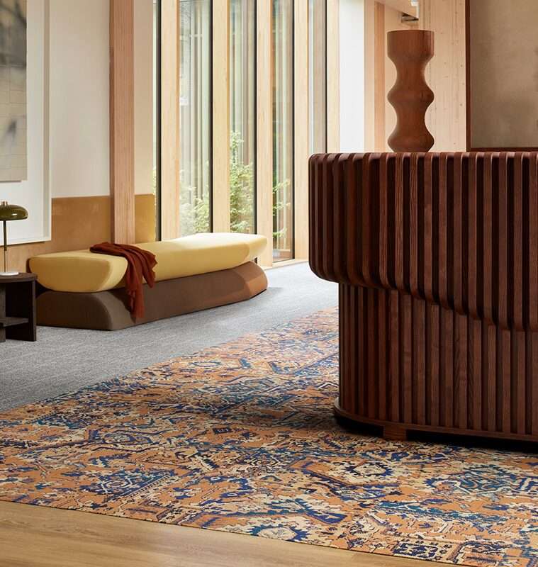
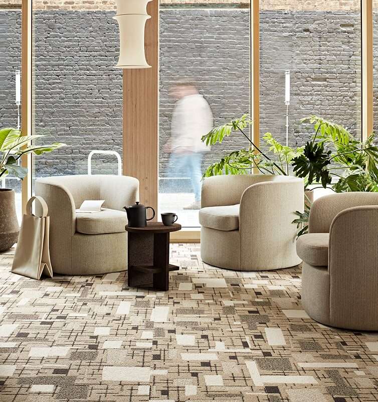
The art direction leans into a deliberate nostalgic quality: heavily propped scenes, retro color palette (rusts, ochres, blues, greens), and models shown from the waist down to keep focus on product and set. Room scenes show the collection across wall-to-wall applications, combinations, and accents — each one a specific user story, each one a case for the collection's versatility.