Santé MD
SantéMD came to Trevelino/Keller with an existing identity that no longer suited it. The customer realized that its existing imagery was overly photoshopped and sexualized and was not attracting the type of clients it sought.
SantéMD engaged Trevelino/Keller for an aggressive rebrand, including a new logo, messaging, brand identity, packaging, advertising campaign, and digital strategy. Throughout the contract with SantéMD, I was responsible for the overall visual strategy, execution, and communication with stakeholders.
PROJECT DETAILS:
Brand Identity & Packaging Design
Roles:
Design Director
*Award Winner, Corporate Identity, Collateral

*Hover over image to view before*
brand IDENTITY
My copywriting colleagues rebranded SantéMD as an “oasis for transformative beauty, health, and wellness,” and I created a sophisticated identity system to match. I always ask clients “What do you love about your brand?” and “What do you hate?” In this case, the client responded that while it liked that people were featured in its branding, the use of stock imagery felt fake. Instead, it wanted to look high-end but feel attainable.
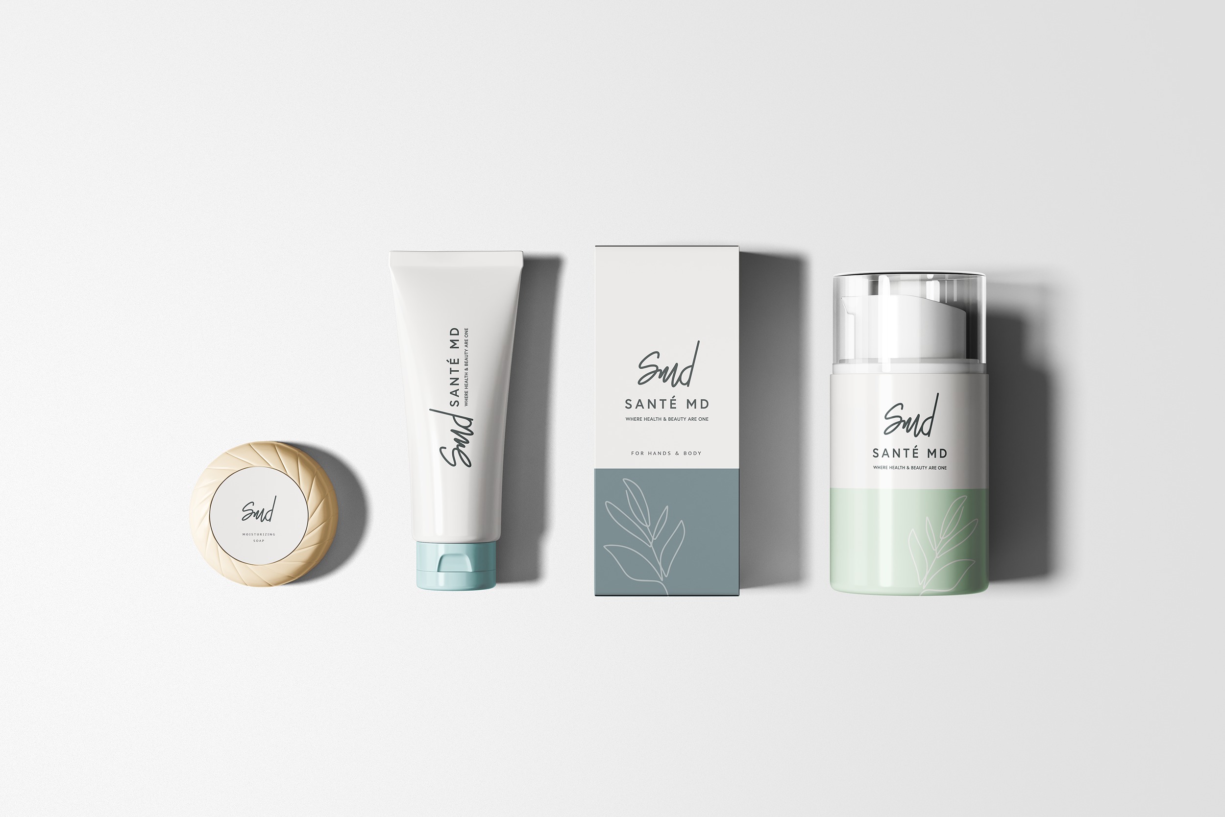
I was happy to help SantéMD leave behind its old identity and discover a new system that is bright and clean and that empowers women instead of objectifying them.


SantéMD loved its new brand identity so much that it engaged Trevelino/Keller to design the packaging for its line of proprietary skincare products. It’s not often that I get to play around with packaging, but I really enjoy it. I designed a suite of merchandise to match the new identity with a bright look and a clean feel.


Credits —
Studio: Trevelino/Keller
Client: Santé MD