"All In"
Building a visual system for Interface's boldest climate commitment
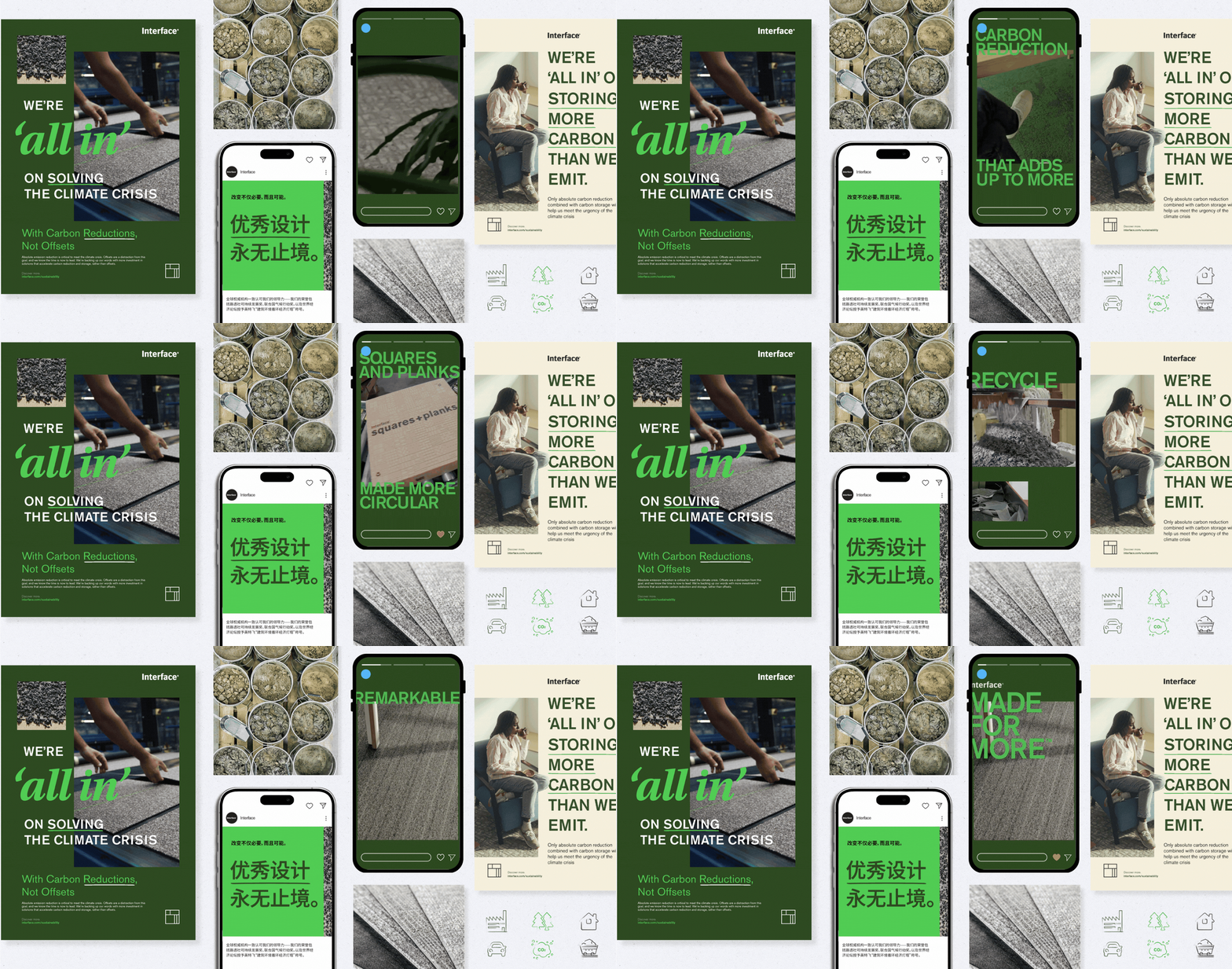
One system for every market Interface operates in. From factory floors to global ad campaigns, "All In" gave Interface's boldest climate commitment a visual language that traveled, and a foundation the company is still building on today.
Role:
Lead Designer & Owner, Sustainability Visual Identity
Scope:
Global rollout across 20+ languages, every customer and employee touchpoint
The Challenge
Sustainability had become the background noise of every industry. Vague climate commitments were everywhere, and the more companies said, the less anyone believed.
Interface had something most didn't: thirty years of genuine sustainability leadership, a documented legacy stretching back to founder Ray Anderson's defining moment in 1994. But a legacy alone doesn't move people. The challenge wasn't just how Interface looked — it was how Interface showed up. In every execution, in every market, at every level of the business.
The real brief was bigger than visual identity. It was about making sustainability legible — clear and compelling enough that employees and customers didn't just nod along, but started paying attention and making different decisions. Design as a tool for behavior change, not just brand polish.
The Approach
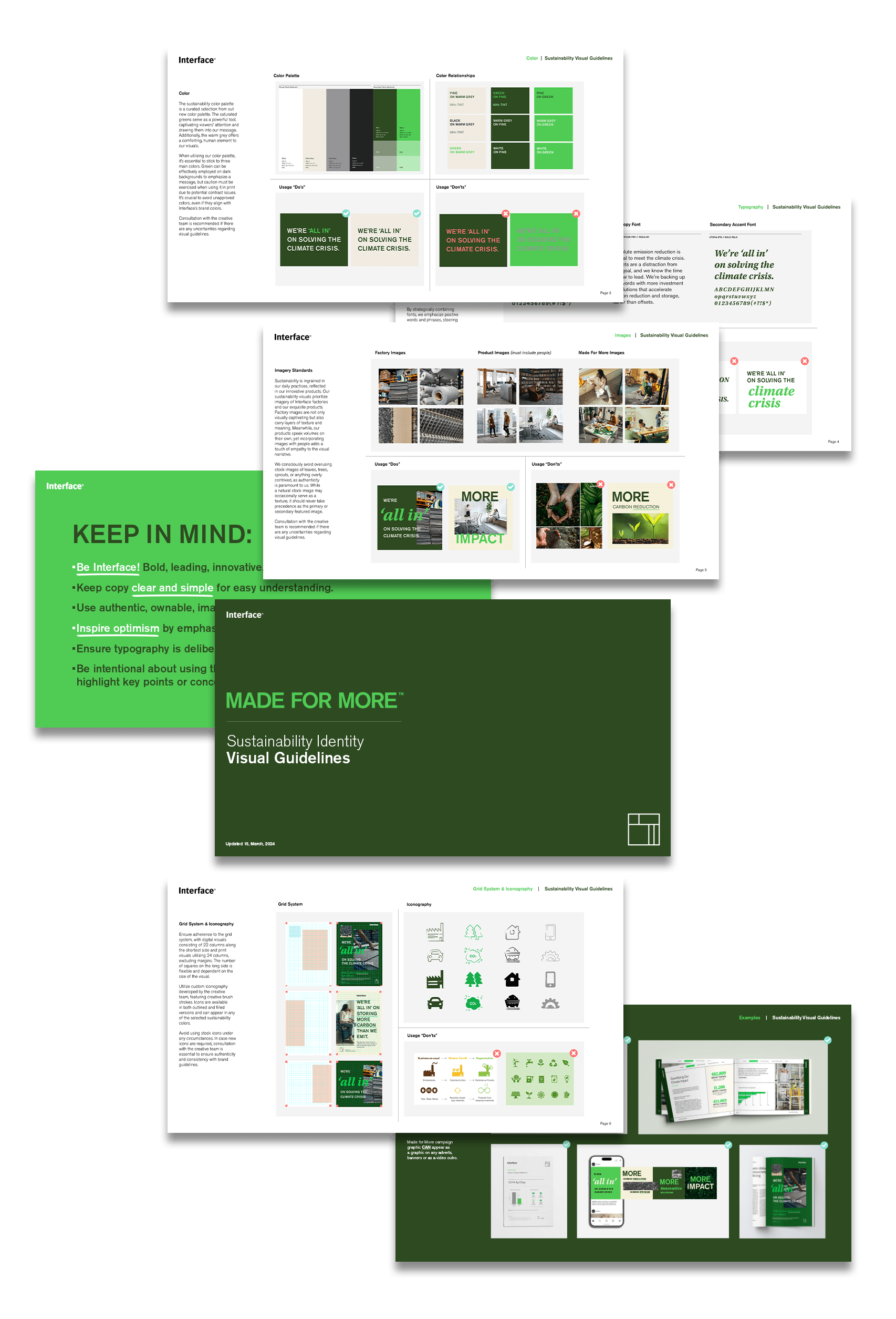
I built the identity system from the ground up: color, typography, photography direction, iconography, and grid, with full ownership of execution.
Every decision was made in service of one idea: sustainability shouldn't feel like a compliance exercise. It should feel like something worth being part of.
Photography: No stock leaves, no hands cupping soil. I directed all imagery to feature Interface's actual manufacturing facilities, real products, and real people. Authenticity over decoration, because the story Interface has to tell is real, and the visuals needed to match.
Typography: A secondary serif, reserved only for genuinely optimistic language, never used to emphasize hard or negative concepts. Tone of voice, built into the type system itself.
Color & Icons: A disciplined three-color palette and custom iconography, so the system would feel distinctly Interface, not interchangeable with any other sustainability campaign.
The result was a system designed to translate complexity into clarity, making ambitious climate concepts like carbon negative manufacturing and science-based targets feel accessible, not abstract.
Built to Scale
This wasn't a single campaign, it was infrastructure.
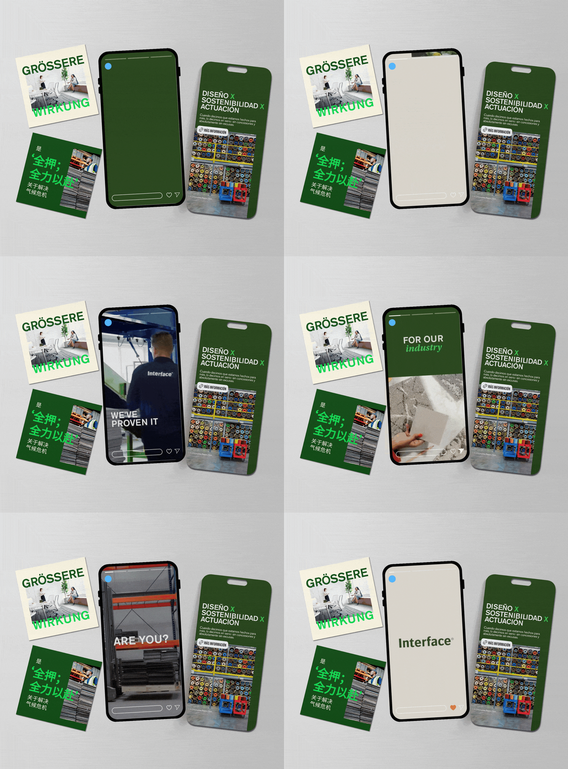
The system needed to work everywhere Interface shows up. Translated into 20+ languages and deployed across every touchpoint — from advertising and trade shows to internal communications — reaching employees and customers in 80+ countries.
When a sales rep in Amsterdam opens a presentation and a designer in Shanghai sees a product brochure and a factory worker in Georgia completes sustainability training, they're all inside the same system, speaking the same language.
More Than Visual
The most meaningful measure of this system isn't reach, it's what it made possible.
Two years after launch, Interface is communicating with a specificity and confidence that didn't exist before. The conversation has evolved from broad legacy "Interface brought sustainability into the flooring industry" to precise, provable impact: how used carpet tile is recycled into new yarn and backing, how carbon is stored in products rather than offset, how every decision across a global supply chain compounds into something measurable.
The system created a platform. It gave the organization the clarity and credibility to go deeper, to graduate from commitment to proof.
And because Interface sets the standard for an industry, that shift doesn't stay inside the company. It ripples. Suppliers raise their bar. Customers ask better questions. Competitors have to respond. Small decisions, made by more people, amplified at scale.
That's what design can do when it's built for behavior change, not just brand recognition.